Arabescato Corchia vs Arabescato Orobico: Which Movement Belongs on a Feature Wall?
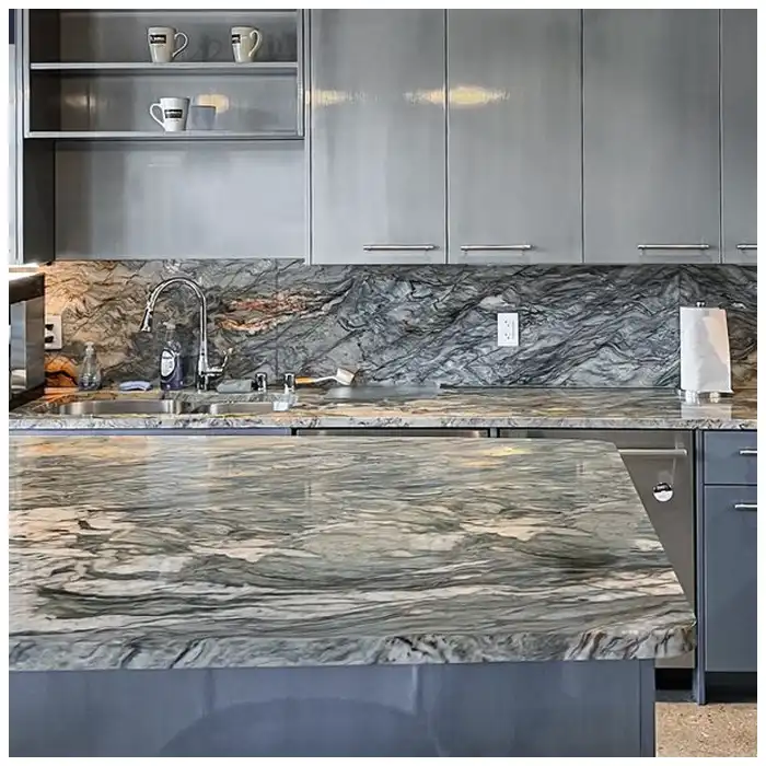
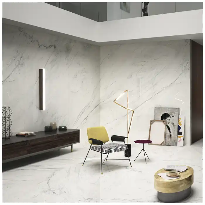
Standing at the end of a room, I see the difference before I walk closer. One face keeps a broad white interval around its dark movement; the other folds grey, brown, and warmer mineral bands into a denser field. Neither answer is wrong, because the two stones are answering different questions about the same wall: where the eye should rest and where it may speak.
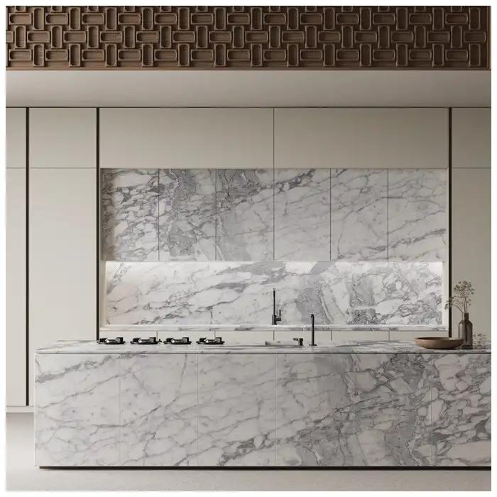
The useful question in Arabescato Corchia vs Arabescato Orobico is exactly that balance. I compare the full elevation at the approach distance, with natural light, artificial light, openings, furniture, and seam positions already drawn, before either material is offered to the room.
A wall that exhausts the eye in the first minute has missed the test, however rare the material may be; a face earns its place when its density suits the space around it.
Weigh Arabescato Corchia vs Arabescato Orobico before Colour Preference
I begin with visual weight, not with favourite color. Corchia usually keeps more pale field between its grey and charcoal lines, which lets one strong gesture read across a large wall; Orobico often carries colour in layers, so the same area can feel fuller and slower to the eye. Both statements depend on the selected supply, because current slabs vary from block to block.
The record I keep lists the pale intervals, the density of movement, and the dominant mineral colours for each candidate face, together with the slab numbers. When the wall outline is drawn over those faces, the visual weight becomes measurable instead of impressionistic: I can see whether a panel holds enough rest for the room that will live with it.
A first reading is confirmed against the plan rather than trusted from the yard. I draw the wall width and height over each face at scale and walk the approach mentally: a face that looked balanced in the warehouse can become all movement when the elevation crops its outer field, or can feel thin when the wall is wider than the reserve allows.
Read White Space and Layered Depth Separately
White space is Corchia’s main instrument. A calcite field that reads as quiet from across a hall can carry faint clouds and hairline mineral paths up close, and that reserve is what lets a dark vein feel architectural rather than busy. I judge the pale ground first and check that openings and furniture will not consume it.
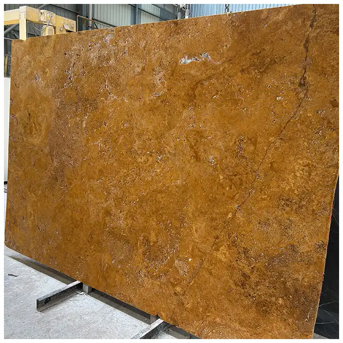
Layered depth is Orobico’s answer. Grey, brown, gold, and warmer red passages stack through the face in ways that change under directional light, so I read Orobico in motion rather than from one still image. The available Arabescato Orobico Marble faces are compared this way before a wall is discussed.
Layered depth also rewards a change of light. Orobico passages that sit quiet under diffuse daylight can pick up warmth from a low lamp, while the same bands flatten again under a cool source; I read every candidate face in at least two light conditions before the finish conversation starts.
For Arabescato Corchia vs Arabescato Orobico, the release starts with visual weight, white space, and layered depth on complete current faces, never with trade-name descriptions alone.
Test Both Stones at the Wall’s Real Viewing Distance
A wall is read from fixed points: the corridor end, the double-height stair landing, the doorway of the adjoining room, or the seat opposite a fireplace. I place each candidate face in a scaled elevation and view it from those points before deciding, because a composition that works from one approach can fail from another.
The distance test changes with the room type. A pale Corchia field can hold a long hall without effort, while a compact lobby may need Orobico’s density to feel furnished; the same logic reverses when the space is already busy with joinery, art, or strong daylight. I never assume which stone fits; I stand in the plan and let the wall tell me.
When an opening interrupts the elevation, I add it to the test: a fireplace breast, a door, a display niche, or a television each removes or claims part of the drawing. The wall is approved with its openings drawn, because an unbroken photograph of the stone is not the wall the room will receive.
The distance test also sets the seam budget. A wall seen only from across the room tolerates a seam that a wall passed at arm’s length will not, and a double-height surface viewed from a stair changes the acceptable joint spacing and the anchoring detail. I note the viewing extremes on the elevation before the panel layout is fixed.
Choose Bookmatch, Flow Match, or Independent Panels
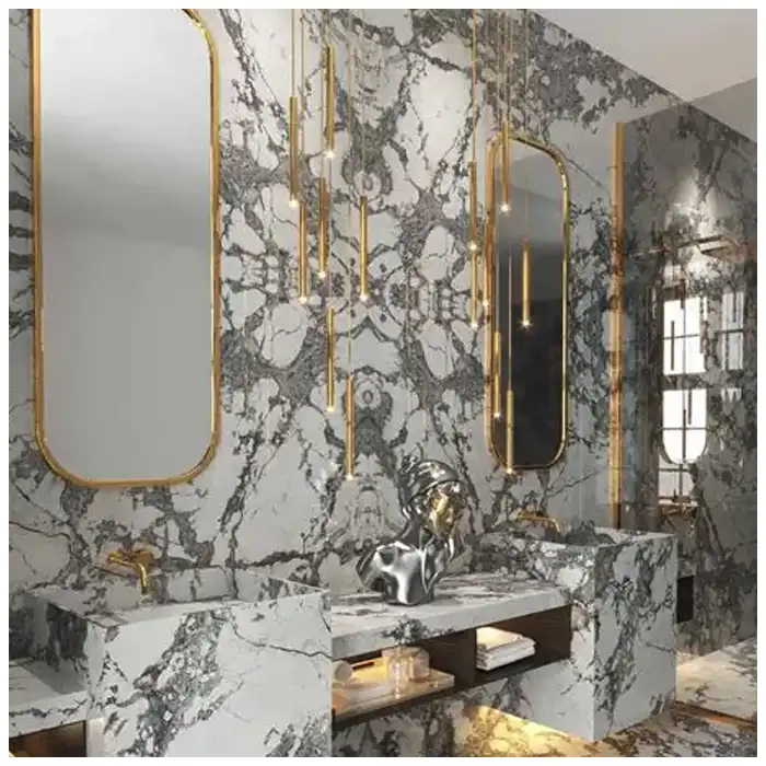
Bookmatching mirrors the drawing around a central seam and can give a large wall a deliberate figure; flow matching follows the sequential direction of the faces without symmetry; independent panels keep each slab whole. I choose between them by laying the real companion faces together, never from two cropped phone images.
A mirrored Corchia pair can double a dark sweep into a strong centre, while mirrored Orobico may make layered colour feel heavier at the seam. Where the panel split is forced by dimensions, transport, or openings, the seam position becomes part of the design review rather than an afterthought, and the steps in Bookmatched Stone Walls: What to Confirm before Fabrication apply.
Use Finish and Light to Set the Contrast
Finish controls how each stone announces itself. Polish can deepen both the pale and the dark passages and double the reflection of a window across the wall; honing flattens that glare and can quiet layered color, which suits a room where light already moves. I compare current polished and honed samples of both Arabescato Corchia marble and Orobico under the project’s daylight and lamps before approving either.
The two stones answer the same lamp differently. Warm directional light can deepen the brown or red passages in selected Orobico faces, while pale Corchia under the same lamp keeps its grey neutrality; neither behaviour is a defect, but each changes which wall benefits. Samples on representative areas, photographed under known light, belong to the record.
Finish samples should cross the palette of the face. A polished sample cut from a pale Corchia field behaves differently from one through a dark vein, and the same is true of honed Orobico layers, so I take samples from representative zones and view them together at the wall’s intended distance.
Place Seams, Openings, and Returns for the Wall
A wall seam cuts the drawing somewhere, so I position it where the mineral field already pauses. Returns at the wall ends, the sides of a fireplace breast, door reveals, and inside corners each turn the face at a new plane; I plan the return strip from the same vein family and mark its orientation so the drawing continues around the corner instead of stopping awkwardly.
Panels that meet a ceiling, floor, or adjoining surface need their edge treatment and support reviewed together. Anchoring, fixing, and the backing conditions belong to the wall spec, and I keep those notes on the same drawing as the seam plan so fabrication and installation read one layout. The Luxury Natural Stone Slabs Guide keeps the wider fabrication and handover conditions in one place, and I read it alongside the wall drawing before the seam plan is final.
Inside corners concentrate the drawing. When two wall planes meet, the vein may continue across the corner or stop at the arris, and I decide which reading the room needs before the return strips are cut; a deliberate continuation reads as architecture, while an accidental break reads as an error.
Decide Which Material the Room Can Hold
The room is the last judge. A tall, quiet entrance can carry either stone; a narrow corridor compresses both, and a space crowded with furniture or art may need the quieter face whichever quarry it came from. I walk the plan with the material palette and let the wall keep only as much movement as the room can absorb.
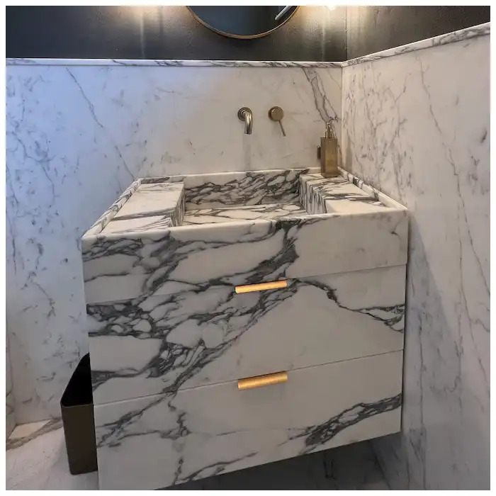
When the room can hold either stone, Arabescato Corchia vs Arabescato Orobico is decided by the quieter margin: the face that keeps its balance beside the furniture and the light is the one that will still read well in a year.
Using both stones in one project is possible when separate zones give each a clear role, but mixing them within one continuous field needs exceptional control over tone and rhythm. Trade names describe recognizable families; the quarry section and current block decide the actual face, so physical comparison under consistent light outranks every general description.
The surroundings decide the final vote. A stone that looks right beside an empty render can fail beside walnut joinery or a busy rug, so I place colour and material samples of the room against the face before the order is confirmed. For Arabescato Corchia vs Arabescato Orobico, that last comparison settles more arguments than any description of either stone.
| Decision point | Arabescato Corchia: evidence to inspect | Arabescato Orobico: evidence to inspect |
|---|---|---|
| Visual rest | Broad pale fields around expressive lines | Quieter intervals within denser layered movement |
| Color depth | White, grey, and charcoal relationships | Grey, brown, gold, or red mineral passages |
| Matching | Bookmatch symmetry or broad flow potential | Layered pairs that may intensify at the centre seam |
| Light | Contrast and crystal reflection on pale ground | Depth and color shift within darker bands |
| Room fit | Airy compositions needing one strong gesture | Rooms able to carry denser material weight |
Seam position is settled before either material is approved. On a wall, the joint should fall where the movement is calmest, because a seam that cuts a dense charcoal passage announces itself at every viewing distance. I mark the seam on the elevation, then compare how each face behaves on both sides of that line: Corchia usually keeps a readable rhythm across the break, while Orobico can concentrate its colour on one panel and leave the other quieter. If the pair only works when the seam is hidden, the room is being asked to accept a condition the drawing cannot guarantee, and the decision returns to the slab rack.
The Hard-Won Lesson: Never pick the bookmatch from two cropped phone images
Cropping removes the outer white space and can make a pair appear more symmetrical than the full faces allow. When panels open around a real centre seam, repairs, thickness, edge losses, and unequal movement can change the entire figure, so the pair that looked perfect in the gallery view fails at the wall.
The Lesson: Review both complete companion faces with the seam and wall outline drawn at scale.
The acceptance file for Arabescato Corchia vs Arabescato Orobico pairs the movement map with the scaled crop: one fixes the approved condition, the other shows how the decision reached production or installation.
Choosing between Two Material Families for One Wall
Corchia answers rooms that need one gesture
A pale field can make a single dark movement feel architectural when openings and furniture leave enough breathing space. I reserve this answer for walls with a clear axis and a quiet palette around them.
Orobico carries a denser interior
Layered colour may suit rooms with controlled light and quieter surrounding materials, provided the wall does not become visually crowded. The density is the feature, and it needs walls large enough to hold it.
The seam is part of the design
Bookmatch, flow match, independent panels, or a deliberate interruption should be selected from actual companion faces at scale. Before release I return to Arabescato Corchia vs Arabescato Orobico with the full-face studies and the wall outline open together, so the visible result and the approved elevation stay one document.
Frequently Asked Questions
1. What is the main difference in Arabescato Corchia vs Arabescato Orobico?
Corchia often reads with more white field and grey to charcoal movement, while Orobico can carry denser layered color. Current slabs vary and must be compared directly.
2. Which marble is better for a bookmatched wall?
Either may work when sequential faces, seam behavior, repairs, thickness, usable size, color balance, and the full mirrored composition are acceptable.
3. Does a polished finish make the wall look darker?
Polish can deepen color and reflection, while room light and viewing angle also affect perception. Compare current polished and honed samples.
4. Can the two materials be used in one project?
Yes, if separate zones and the wider material palette give each a clear role. Mixing them within one continuous field needs exceptional control.
5. What should I do if the installed wall feels too busy?
Photograph the full approach under known light, stop surface alteration, then compare crop, orientation, seam, openings, finish, and surrounding materials with the approved elevation.
Quick-Reference Checklist for Arabescato Corchia vs Arabescato Orobico
- Compare complete current faces.
- Mark the real wall outline.
- View both options from room distance.
- Test bookmatch and flow-match seams.
- Overlay openings returns and furniture.
- Compare polish and hone under project light.
- Reserve compatible companion slabs.
Final Conclusion
The stronger wall choice depends on visual rest, mineral depth, room distance, seam behavior, finish, light, openings, and the quiet or active materials already sharing the room. For Arabescato Corchia vs Arabescato Orobico, the accepted result must remain tied to the drawings, samples, measurements, and application records.
MQ STONE would rather choose the quieter face than make rarity compete with architecture, because a wall is lived with long after the novelty of the stone has passed.
References
- سنگ مرمر, Wikipedia.
- ASTM C119 Standard Terminology Relating to Dimension Stone, ASTM International
- ASTM C503/C503M Standard Specification for Marble Dimension Stone, ASTM International
- ASTM C1721 Standard Guide for Petrographic Examination of Dimension Stone, ASTM International
- Dimension Stone Design Manual, Natural Stone Institute
- Marble and Onyx, Dimension Stone Design Manual, Natural Stone Institute